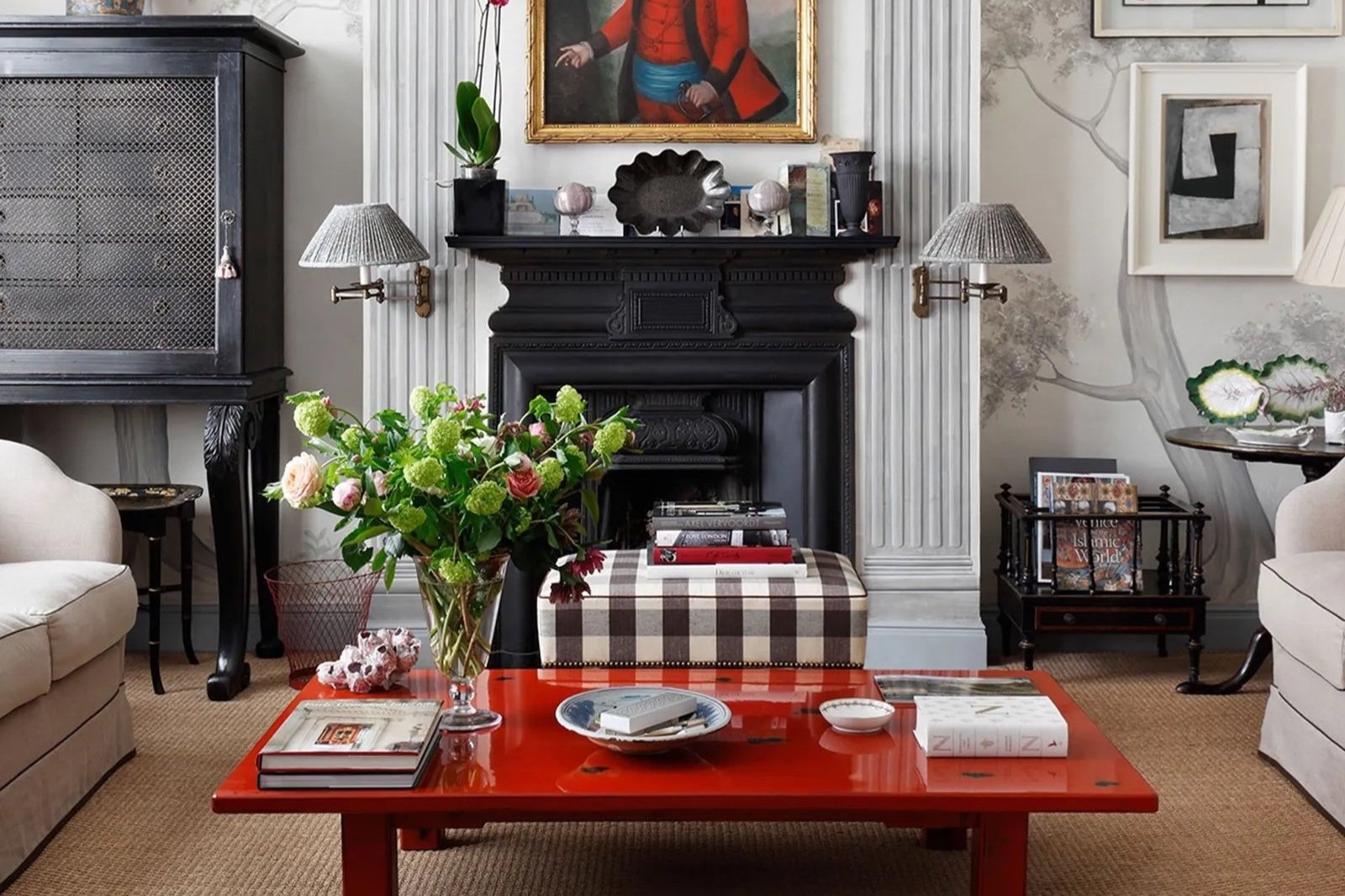
Coffee Table Styling For Every Table Shape
Find out which configuration of accents looks best for every shape of coffee table.
Have you ever started arranging objects on a coffee table only to find something was off? It just felt off balance or maybe it looked like something was missing. It’s very likely that the assemblage of accents was not suited to the shape. Study enough coffee tables (and I have!), and you’ll start to notice that there’s a bit of a formula for how to style each table shape.
Well styled coffee tables — with objects placed just so yet appearing so effortless — might seem hard to achieve, but I promise it’s a lot easier than it looks. I will break down how to style coffee tables in all shapes and provide a breakdown of objects needed to create the look at home. Here you can find stylish and timeless coffee table decor for every style to fill in the gaps of anything you don’t have (or start completely from scratch!).
You may also be interested in:
Coffee Table Styling Tips
Here are some basic guidelines that apply to styling coffee tables, of all shapes and sizes.
Tell your personal story. What does that mean?! Well, you want to display objects that are personal to you. The general rule is that each object should be special — either something you really love or that has meaning to you. Can you can pick it up and tell a story about it? (This was a gift from so-so; This is a book of my favorite artist; I got this on a trip.) Having a connection to the objects will automatically make them more interesting to look at, not to mention spark joy when you see them.
Create multiple points of interest. The idea is to excite the eye and keep it moving around the table. Displaying objects at varying heights can help a lot – for instance, choose things that are different heights and display them flat on the table or layer objects to make some higher than others.
Mix it up. Variety is key to adding character to your coffee table. Don’t be afraid to mix colors, shapes, textures, and types of objects. It’s nice to see some combination of books, vases, candles, dishes, objets or sculptural objects.
Hide clutter but not too much. Too much stuff on a table, and your eye goes crazy; on the flip side seeing little knick knacks, or as I like to call them signs of life, can really bring a smile to your face.
Make use of trays where they make sense. Trays are secret weapons. Lots of little things on a table can look chaotic, but if you corral them within a tray, voila, they look organized. Trays also can act as a space divider, which I’ll get into more in the sections below.
Rotate regularly. Nothing on a coffee table is ever set in stone. In fact, swapping in new objects and rearranging things on your coffee table can breath new life into the space. It’s a good idea to do whenever you feel stagnant and during the transition of seasons.
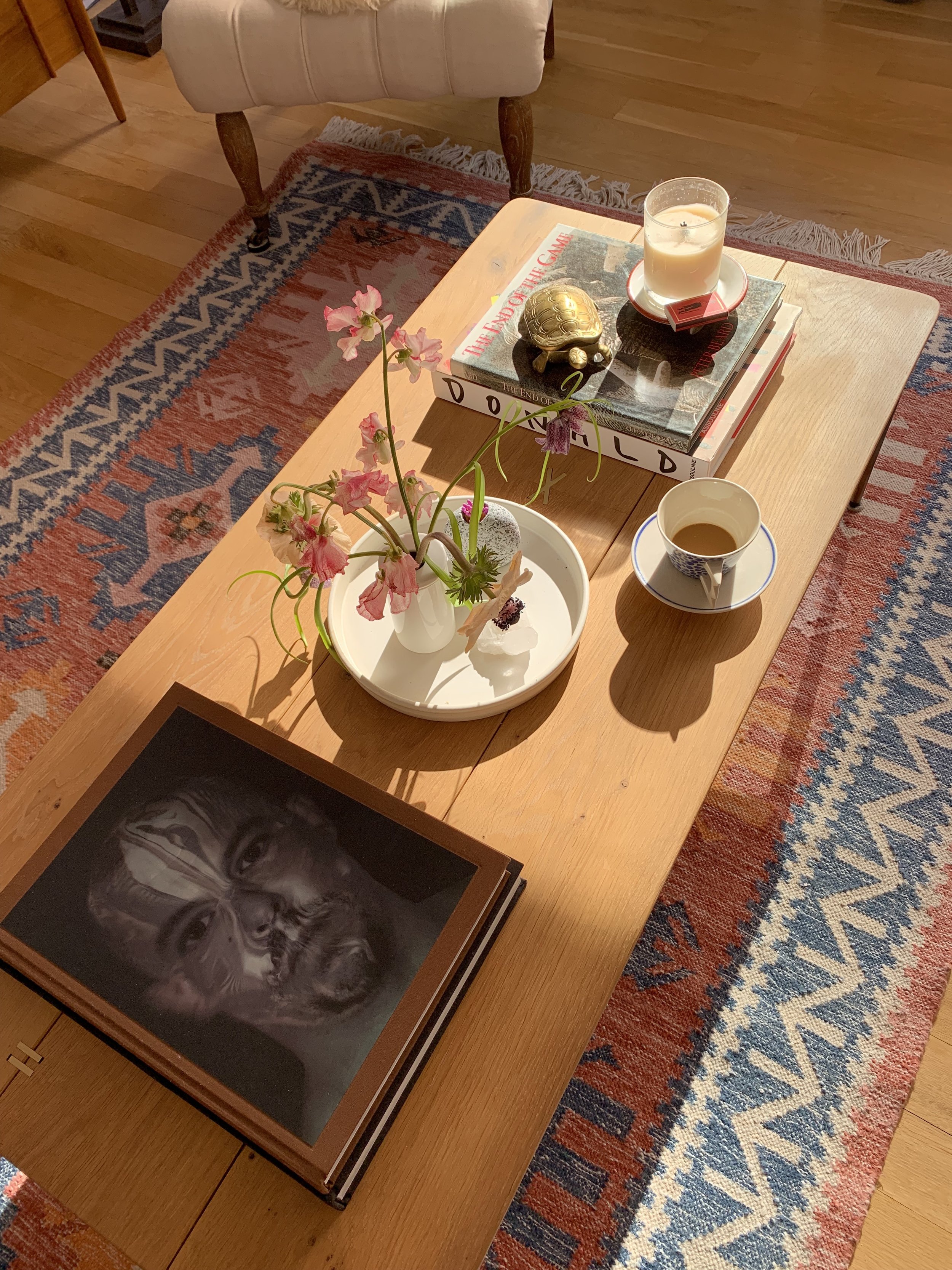
A cluster of interesting objects on the coffee table of Ana Piteira
Luke Edward Hall displays colorful accents on his coffee table
How to Style Coffee Tables by Shape
Below I outline a formula for how to style accents on each coffee table shape. Within this framework, here’s lots of flexibility; nothing is meant to be followed rigidly. Along the way, I’ll point out some additional options to help you customize it exactly to your liking.
Round or Oval
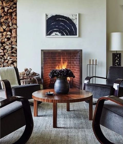
Because the corners are cut off, there is generally less space to style objects on a round or oval table, and everything is concentrated in the center. There are two approaches that both look great and just comes down to whether you prefer a minimal space or a bit more to look at.
Option 1: An Arranged Grouping
Cluster a few large objects at different heights in a triangle shape.
For example:
A vase filled with fresh (or faux) flowers or a cachepot / planter with a potted plant
A decorative bowl
A large book or a stack of a couple of thinner books (you could put a small dish or objet on top)
Optional: place some small, low height decorative objects between the large objects
An example of an arranged grouping with optional small objects placed in between (photo by Paul Massey for House & Garden UK)
Option 2: Minimalist Accent
Place one big decorative accent in the center.
For example:
A very large dish or a shell
A planter or cachepot / planter
Large sculptural object
Round tray (could be adorned with a dish or candle)
Optional: place a small and low height dish to the side
An example of a minimalist accent with an optional small objet beside it (design by @hausofdesignla)
Square
A square is similar to the circle in terms of the number of items, but the layout is a little different because of the square shape.
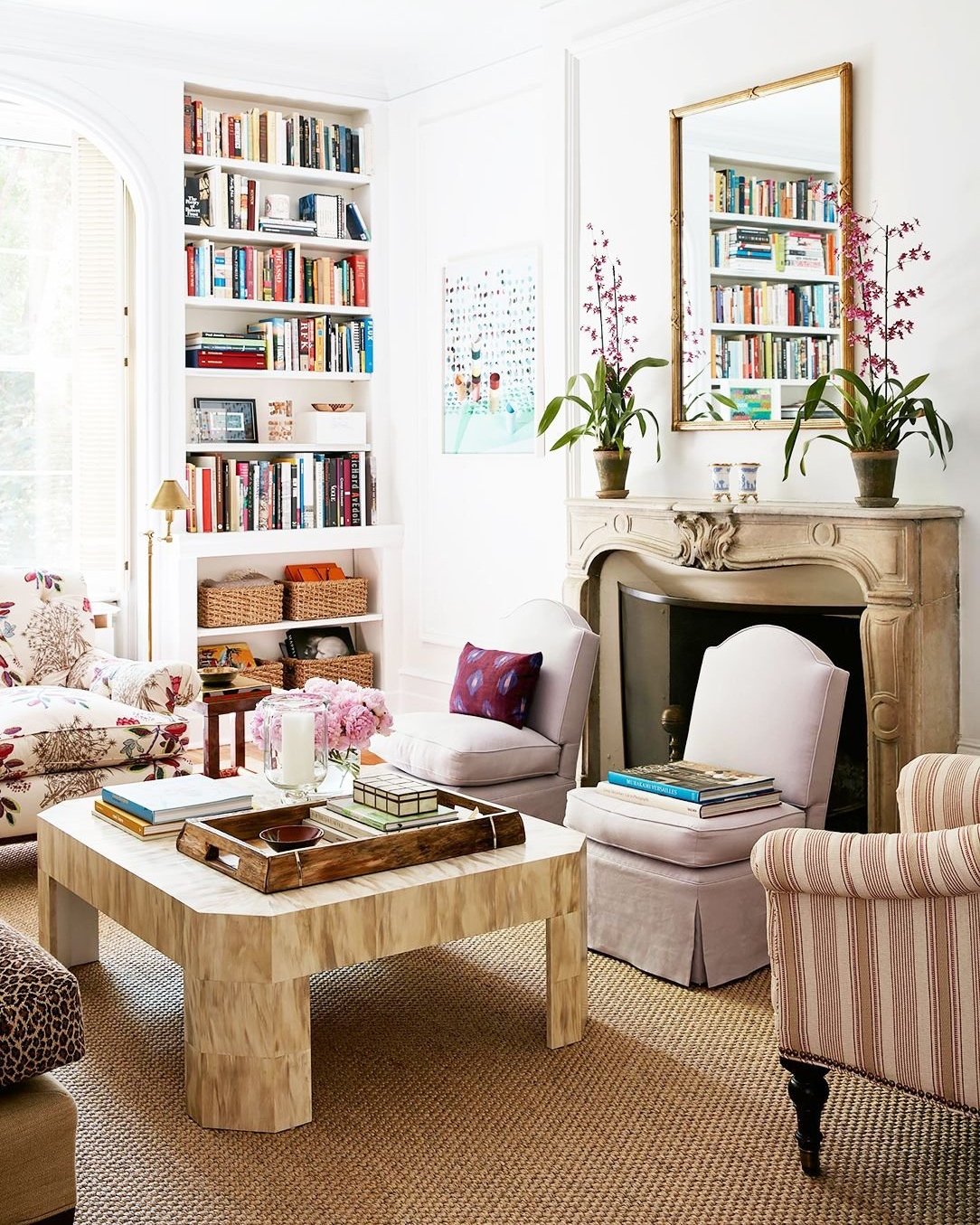
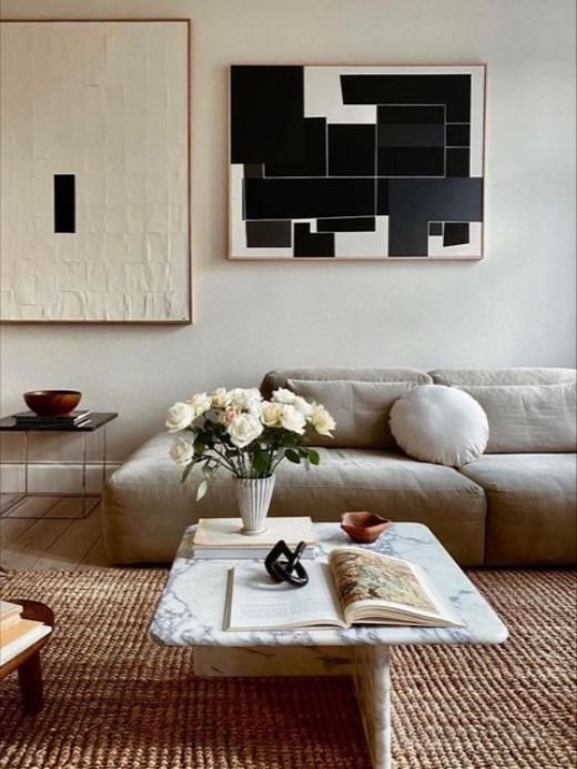
Divide the square into four quadrants, and within it create three sections or ‘scenes’ — one that takes up two squares, hence a rectangular shape, and the two squares across from it. Each section should be composed of at least one object, or two objects can be laid side-by-side within the space.
For example:
Rectangular section: a tray topped with small objects like matches, candle, coasters, or small dishes; an oversized book; or an open book (option to display on a stand)
Square section A: one or two smaller books; option to top with an objet, a dish, or a vase / cachepot
Square section B: a dish, a vase or cachepot, a large candle, or a combo of any two
A square coffee table with a tray in the rectangular section (home of Lauren McGrath)
A minimalist take on a square coffee table with an open book in the rectangular section (via @simonepolk)
Extra Large Square
An oversized square coffee table provides ample space to create a robust and interesting tableau. Envisioning the square as a grid will help you arrange the objects. I’m providing two styling options: one that looks a little more organized and is easier to pull off and another that is a bit more composed and has more variables.
Option 1: Symmetrical Layout
Divide the square into a grid and arrange books and other accents in each of the sections.
For example:
Around the perimeter: stacks of books; layer up to 6 books
In the center place: a potted plant or a vase filled with flowers
Optional: use a square tray in place of a stack of books; fill with a candle and other small objects
Optional: stack other objects on top of the books, like candle sticks, dishes, or objets; since the objects add some height, limit the stacks to 2-3 books
This symmetrical layout features stacks of books with a vase in the center (The Land Gardeners)
An example of a symmetrical coffee table layered with books and various accents (Eleanor Cording-Booth)
Option 2: Artistic Grouping
Divide the square into a grid but instead of filling each square with equally sized objects, place objects of varying sizes (and heights) in only one or two of the spaces in each row. If you want it to look a bit more random, you can move one of the objects in a row slightly toward the edge. Limit to 4-5 objects so there is a bit of space in between them.
For example:
Stack or two of books, with or without an object on top
Tall candle sticks
Sculptural object
Small dish or objet
Vase or cachepot
An example of an artistic grouping (Jackie Villevoye)
Rectangle
A rectangular shaped table is all about working with the dimensions. You can either take full advantage of the space and populate it with objects going down the length (as many or as few as you like), or keep it simple with a single decorative accent.
Option 1: Layered Arrangement
Divide the rectangle into three sections and fill each of them with an object (or 2-3 objects side-by-side). It’s ok if one section is a little wider than the others. Depending on whether you prefer a more streamlined or eclectic look, you can layer other items on top of the base layer.
For example:
Stack of books with option to top with other objects (you could arrange the stack next to an another object within the section, if space will permit)
Rectangular or square tray layered with a vase, a dish and/or an objet
Round dish (if it’s smaller, you can put another book or object beside it)
A streamlined example of a layered rectangular coffee table (Photo by Aaron Leitz for Home & Garden UK)
An example of a layered arrangement on a rectangular coffee table (Design by Joanna Plant)
A layered arrangement with side-by-side groupings of objects in two of the sections (Wendy Nicholl)
Option 2: Single Accent
Take up the center of the table with a proportional rectangular object, leaving space on either side. It should be large otherwise it will feel like it’s floating in space. A rectangular shaped object will fill up the space best and look more balanced.
For example:
Rectangular tray, with an object or two on top
An oversized book oriented in the same direction as the table or a regular sized coffee table flipped open
A rectangular planter filled with a lush plant like orchids
An example of a single accent on a rectangular coffee table (design by Nicola Harding)

