Dear SoS: I Can’t Find A Unique Tablecloth to Work with My Busy Wallpaper
Sense of Spencer seeks to solve your pressing decor dilemmas!
Dear SoS:
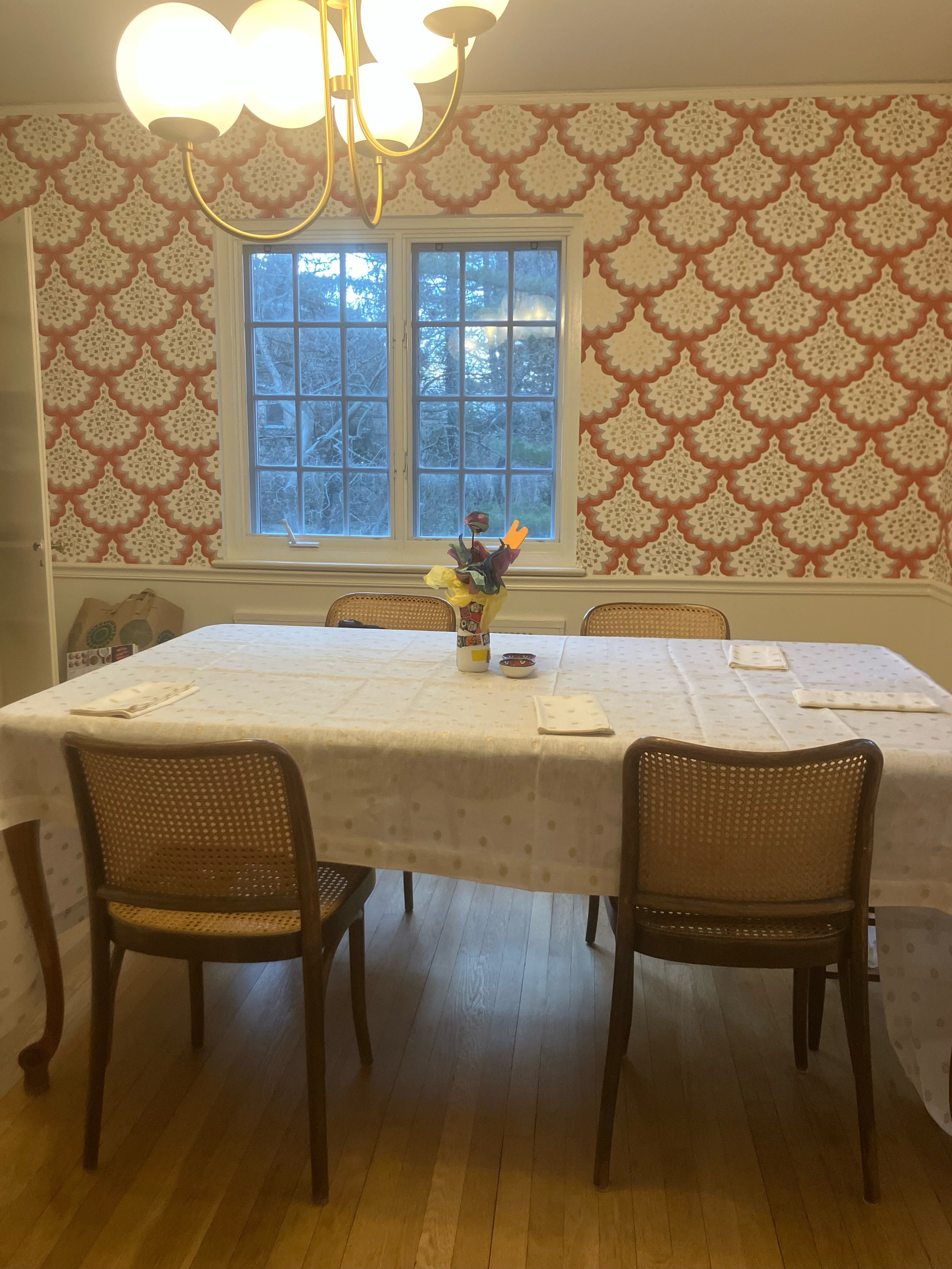
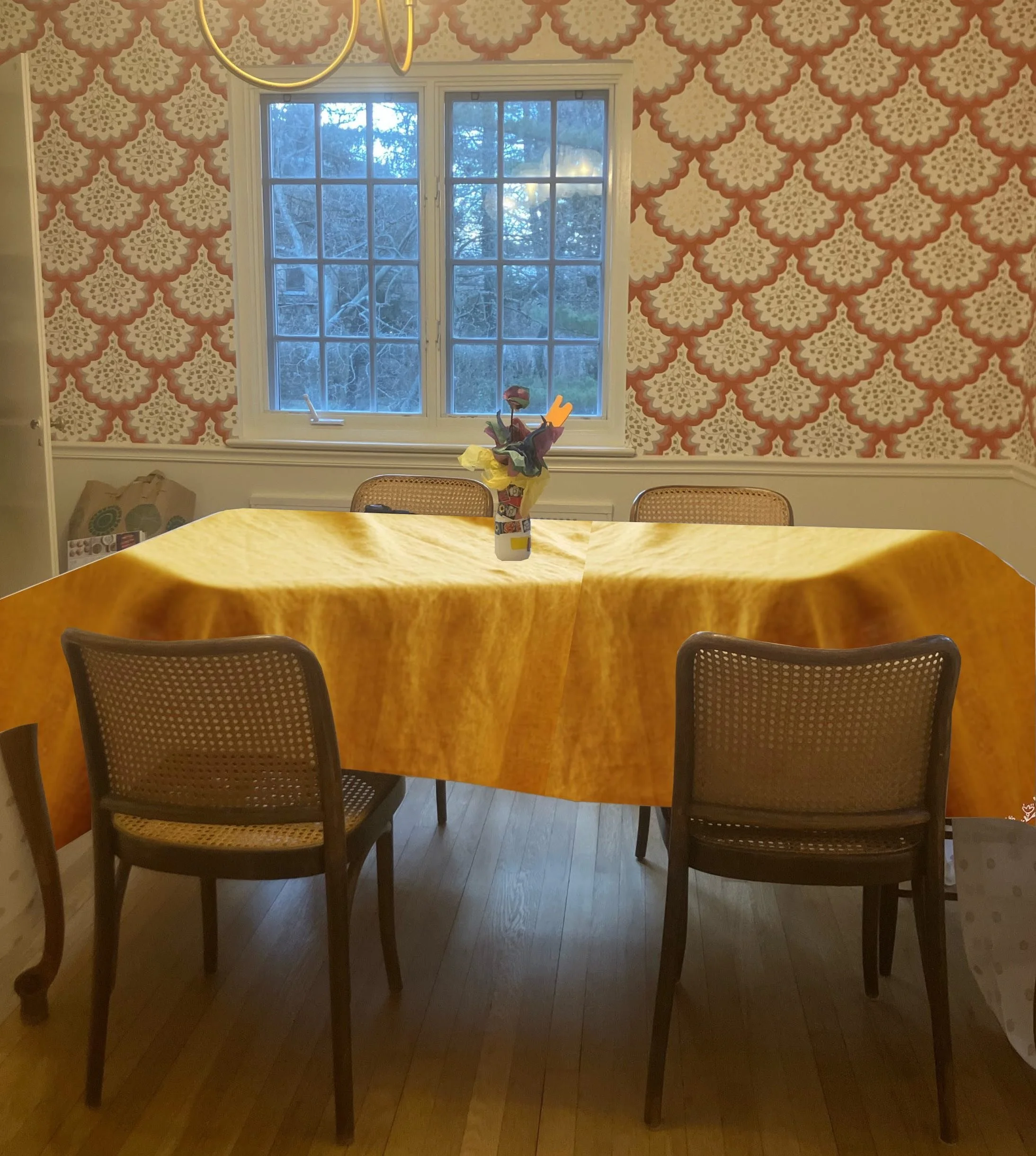
We need a lot of tablecloths because we host a lot, but our dining room wallpaper is loud and I can’t find good ones that match that aren’t dull solid colors. I like quirky stuff and I just can’t do bland ikea bs.
Here’s the reader’s dining room and the busy wallpaper that’s causing issues
Every product is curated independently. Things you buy through our links may earn us a commission.
Tablecloth Woes:
Ah yes, I see, your wallpaper has a dense print and strong color that can make it tricky to work with. Since you are into color and pattern, you are in luck, as mixing patterns or mixing patterns and bold color can be quite arresting. You just have to find the right combos, and Sense of Spencer is here to help.
I’ll walk you through my process. First, I wanted to start off by looking at all the different types of tablecloth options out there, then I thought it might help to look at some stylish examples that nailed the wallpaper/tablecloth combo, and finally I propose a recommendation for your dining room.
Looking at Tablecloths Options
It can be difficult to know where to start when it seems like there are endless options for tablecloth – from patterned chintz to geometric motifs in every color of the rainbow. By establishing the different types of tablecloth patterns and styles, we can rule some out and begin honing in on the type of tablecloths that would fit best in relation to the wallpaper.
Small print
A small, tight design such as miniature floral
Large print
Large, dense repeating patterns which can make a big statement
Large open pattern
A loose, large pattern that tends to be asymmetrical spread out over the background
Geometric prints
Symmetrical designs in bold shapes, sharp angles, or grids
Stripe
A type of repeating pattern that comes in many varieties — from thicker, evenly spaced out awning stripe to a variegated stripe with stripes of varying widths
Solid color
A background made up of one solid color, without any pattern or design
Solid with Design Detail
The background is a solid color covered with an additional design element, like a ruffle, embroidery or texture
Finding Examples of Matching Wallpaper & Tablecloths
I like to find inspiration — and learn from — designers and tastemakers who embrace bold design choices to great effect. So, I went on a hunt for dining rooms with strong walls and tablecloths that are far from dull or withering. Here’s what I found…
Pattern x pattern can be brilliant when done right. It works best when there’s a bit of a contrast – for instance, a large print and a small print, or an abstract print and a large open pattern.
A stripe or a gingham are the most foolproof patterns. They can mix well with almost anything.
In terms of color, these rooms stick to contrasting colors (colors that differ from one another, like green/pink, blue/yellow, and so many more) or tonal colors (different shades of the same color).
Image: Cabana Magazine
In Houghton Hall’s dining room, the namesake Houghton Hall Magnolia Tablecloth by Cabana blends beautifully with the blue floral printed walls. There’s contrast both in the designs — both open patterns but one small, one a bit looser — and colors — blue and pink.
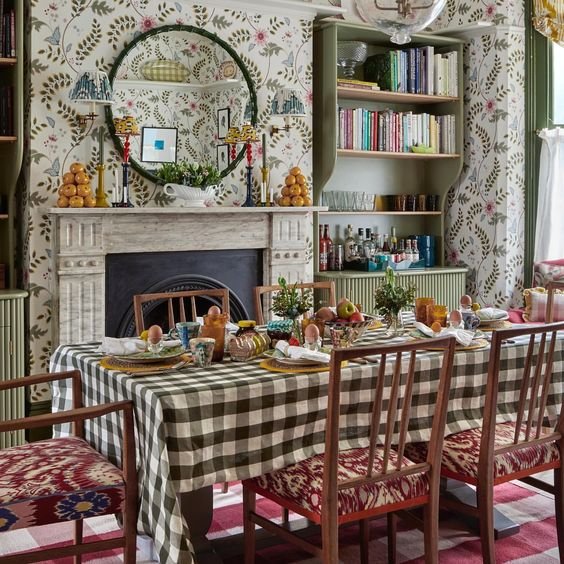
Image: Salvesen Graham
In the eating room of Salvesen Graham founder Nicole Salvesen’s, the brand’s open pattern wallpaper is broken up by a more geometric gingham tablecloth. Tonal coloring helps to connect them – the green of the tablecloth picks up on the green in the wallpaper.
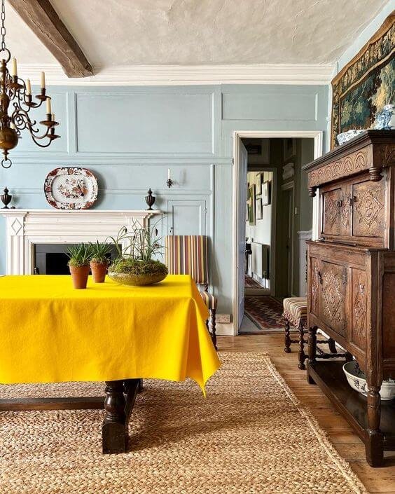
Image: Carlos Sánchez-García
In an example that uses strong color combos without any pattern, designer Carlos Sánchez-García’s pairs a sunshine yellow tablecloth with sky blue colored walls.
The Recommended Tablecloth
The dining room sports wallpaper with a large print in a deep red, which makes a big visual statement. The question is, what unique tablecloth will complement, rather than clash, with it?
Let’s start with color, and go from there. Here are the colors that might work with these walls:
Tonal - pink, red
Contrast - red/green, red/blue (soft blues, darker blues), red/yellow (jewel tone), red/brown (chocolate)
Neutral - white or off-white, with detailing in black or select color
When it comes to pattern, anything with a dense print should be avoided to differentiate it from the walls. Here are some other options:
Large open pattern - a open print like a floral or leaf pattern could balance out the density of the wallpaper and help the room feel a bit lighter
Small print - a tighter print in color would contrast with the large print
Geometric print - the harder edged shapes would provide counterpoint to the organic design in the wallpaper
Option 1: Loose floral, cornflower blue
This rich cornflower blue richly compliments the red walls, and the floral pattern loosens up the space.
As an alternative I like this Sage Green Floral Tablecloth which has a softer coloring.
Option 2: Solid color, mustard yellow
Though this is a solid colored tablecloth, it is anything but dull and boring in this vivid color.
The red of the walls and yellow of the tablecloth look like they are in the same color family.
Option 3: Geometric print, deep blue
I like how this colored background plays off the wallpaper which has a white background.
As well, the harder edged shapes would provide a contrast to the organic design in the wallpaper.
Option 4: Loose floral, pink with reds
This combo is certainly unexpected! This is the softest and most romantic of the options.
The floral print offers a breath of fresh air; the pink is tonal with the red walls, and there are even bits of red in the tablecloth.
Option 5: Small print, classic blue
In a way the design of this paisley echoes that of the wallpaper, but at a smaller scale.
Once again, this darker blue provides a striking contrast with the deep red.

